Recently I had to dig a bit deeper into ways and options on how to change a link href dynamically with jQuery. It’s not really the most beautiful thing one can do, but it can help sometimes to solve problems you never expected to be problems in the first place. The situation was like this: a client of mine had bought and installed a premium WordPress theme already quite some time ago. But it turned out there were some SEO issues to be solved. What was wrong? The theme basically utilizes one navigation in admin, but two navigations in front end – or actually two slightly different iterations of that one navigation: one for wide screens / desktop screens and one for mobile use. The only difference seemed to be the div classes used. So far so good. So why would I now need to change a link with jQuery?
<div style="width:300px; height:250px; margin-left:20px; float:right;"> <script async src="//pagead2.googlesyndication.com/pagead/js/adsbygoogle.js"></script> <!-- cpu-300x250-inline --> <ins class="adsbygoogle" style="display:inline-block;width:300px;height:250px" data-ad-client="ca-pub-7767251772696843" data-ad-slot="5040918527"></ins> <script> (adsbygoogle = window.adsbygoogle || []).push({}); </script> </div> By default the theme handled the main navigation / top navigation items – the ones that are visible on default as anchors. The actual linked navigation items are solely found in the subnavigation. Why? Obviously the theme author tried to make the theme mobile friendly, but didn’t bother to go the extra mile. In detail: on hover the main navigation items reveal their respective subnavigation items. For this to work on touch devices (that have no hover in that respect) the main navigation items must be clicked. Now if the main navigation items were fully functioning links, the mobile website visitor would never have a chance to actually click any of the subnavigation items, because the top navigation would fire the link before the subnavigation was even visible.
For me this basically implied two different problems: the top navigation items were reduced to anchor links making them useless for search engines – and since the top navigation items often consist of powerful keywords, this can be considered as a wasted SEO opportunity. On the other hand dead links (or anchor links, that don’t do anything else than reveal subnavigation items) can be considered bad UX – at least on desktop. The user sees the supposedly important top navigation items – but clicking them doesn’t really have any impact other than revealing the second level navigation.
Changing a link dynamically – jQuery to the rescue
So what we did is add links to the main navigation and then change them to anchors for the mobile iteration. And with a few lines of jQuery this was rather easy to accomplish.
Working on the solution, another oddity appeared. Usually you would look for the link either by an id or a class and then point the jQuery script at that exact link. In this case the surrounding divs had no distinct id. Actually neither the links nor the surrounding div containers were equipped with any kind of distinct id or class. So we used the link (href) itself instead to identify the link that needed to be changed. Here’s the script that worked for us:
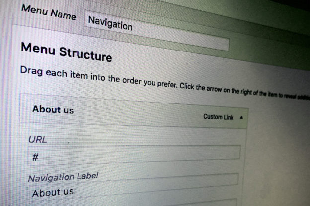
jQuery(".sf-mobile-menu a[href='/about-us/']").attr('href', '#');
For every link we need one line.
If we had distinct identifiers on the surrounding div containers, instead we could have also looked for the first link inside the parent element as described on this forum post at stackexchange:
jQuery('.sf-mobile-menu #content_1 li:first a').attr('href', '#');
if you have more than one link you want to change you could also automate this in a jQuery loop:
$('.content').each( function() {
    $(this).find('li:first a').attr('href', '#');
});
or like this:
$('.content').each( function() {
    $(this).find('li a').first().attr('href');
});
Alternatively we could also use a wordpress function to loop through the navigation and then apply the jQuery to each element – but I guess the jQuery loop will do the job just fine.
Responsiveness: make jQuery change links for specific screen width
<div style="width:300px; height:250px; margin-left:20px; float:right;"> <script async src="//pagead2.googlesyndication.com/pagead/js/adsbygoogle.js"></script> <!-- cpu-300x250-inline --> <ins class="adsbygoogle" style="display:inline-block;width:300px;height:250px" data-ad-client="ca-pub-7767251772696843" data-ad-slot="5040918527"></ins> <script> (adsbygoogle = window.adsbygoogle || []).push({}); </script> </div>In case there is actually only one navigation you could also add something I would call a jQuery listener – a snippet that listens to css classes – as pointed out in this article “Firing Responsive jQuery Functions based on CSS Media Queries Rather than Window Width” over at Fourfront’s Blog. This is basically the perfect use case for this method since we want to change the links for the mobile navigation – so we know already what element we want to listen to. We only need to fire the jQuery when the mobile navigation is visible.
function checkSize(){
    if (jQuery("#az-header.h-classic .az-menu-trigger").css("visibility") == "visible" ){
        /* your code */
    }
}
Hope this helps.