Hover effects are sometime overused – but when done right they can be a useful detail, having a positive effect on the webdesign and the overall user experience by simply highlighting clickable images on hover. Here is a short introduction how to implement a Grayscale-Color-Hover-Effect for the images on your website.
Introduction
If you wanted a nice ‘grayscale effect’ (“black and white”) for your images, back in the times before CSS3, you would have to upload two images. You would probably have uploaded the full color version and a grayscale version of the actual image and then changed the image path / URL dynamically with a small JavaScript snippet.
For a long time that was at least my preferred method if I needed such an effect in a website. This JavaScript method basically worked quite well – but it was also a bit unhandy. You would of course first have to actually make that second image – then upload it. You would then basically have doubled the amount of data a user would have to load for viewing each image – additionally the second ‘hover’ images had to be pre-loaded in the background.
Then a rather nifty css trick came along. You would only have one image file but there would be two versions of the image: a full color version and the grayscale version. You would then use the image as a background image, crop it with a container (overflow hidden) and simply move the position on hover. No JavaScript needed, but still not too elegant. The images were basically hidden from search engines – and the image file (sprite) would be at least twice the size of the actual image. Bad for SEO, bad for you.
For smaller images used as navigation elements (e.g. in slideshows) this “sprite trick” is however still popular today. You can for example easily style slideshows (for example ‘out of the box slideshows’ that come with many premium WordPress themes) by simply replacing the sprite. But for larger images like teaser images this technique is not practical and rather not recommended.
CSS3 to the rescue!
Finally CSS3 brings on a solution to this matter. Desaturating pictures with CSS only is much more convenient than using a desaturated version of an image – especially when you are working with editors and/or WordPress- or Drupal based CMS. You don’t need to follow complicated workflows, no JavaScript involved. You basically just need to upload one image and add a CSS class that will trigger the grayscale effect on hover. This can for example be used to highlight preview pictures / thumbnails on hover like teaser images or the like.
Here is a working example of the effect:

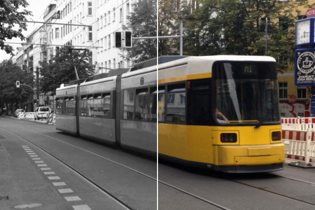
hover the mouse over the image to get the color back
Of course one could question if using this effect was ‘necessary’ – or if hover effects are useful at all. But I won’t go into that discussion now. For some websites it may make sense to have a hover effect applied to images – and I personally quite like the grayscale effect, if used cautiously. In my opinion the change from grayscale to full-color is more subtle than for example zooming in/out or changing the opacity of a preview thumbnail. This is even more the case, if you decide not to desaturate the images completely and maybe also to add a transition to the hover effect.
hover the image to get the color back
The desaturation effect can be achieved using the CSS filter property. Most modern browsers will render filter correctly, however it is (of course) not fully compatible with Internet Explorer – at least not with the recent versions IE-10, IE-11 and also Edge is lacking support. However – older Internet Explorer versions actually do know the filter property but use a different approach than the upcoming CSS3 specification would suggest. Instead of filter: grayscale you can use filter: gray to target IE versions 6–9.
<div style="width:300px; height:250px; margin-left:20px; float:right;"> <script async src="//pagead2.googlesyndication.com/pagead/js/adsbygoogle.js"></script> <!-- cpu-300x250-inline --> <ins class="adsbygoogle" style="display:inline-block;width:300px;height:250px" data-ad-client="ca-pub-7767251772696843" data-ad-slot="5040918527"></ins> <script> (adsbygoogle = window.adsbygoogle || []).push({}); </script> </div> You could however use a small JavaScript snippet to make also newer versions of Internet Explorer desaturate images, but I don’t like that approach and I will not dive into that in this post. I would rather want browser manufacturers support this useful feature. IMHO implementing workarounds to make the grayscale effect work won’t make browser manufacturers move towards this direction. Anyways…
Also Firefox < V.35 does not support filter: grayscale – instead you’ll have to implement a small workaround to address older Firefox versions. But since that’s a rather simple and generally interesting trick I’ll quickly mention the details: you can use an SVG-image to make Firefox 4 – 34 desaturate images. Ok – enough introduction – here the details how to get the css grayscale hover effect working:
Grayscale Hover Effect CSS Code Samples
In the above example, the color images, that shall be displayed in grayscale, are marked with a class named “desaturate”
<img src="/bilder/farbfoto.jpg" class="desaturate thumbnail">
For almost all browsers we can now write a suitable CSS property that will take the color from the image so they are displayed in gray / grayscale:
.desaturate {
    filter: grayscale(100%); /* Standard CSS */
    -webkit-filter: grayscale(100%); /* CSS for Webkit Browsers */
    filter: url(/elements/grayscale.svg#desaturate); /* Firefox 4-34 */
    filter: gray;  /* Internet Explorer IE6-9 */
    -webkit-filter: grayscale(1); /* Old WebKit Browsers */
}
On mouse-over (:hover) we want to display the full color version of the image. So we’ll have to remove the original filter-effects from images – or actually reset them:
.desaturate:hover {
    filter: grayscale(0%);
    filter: none;
    -webkit-filter: grayscale(0); /* Old WebKit */
}
Some details about the SVG image: since SVG-images are not really images, but basically collections of tags and vectors that are described using XML statements, we can easily generate this image by copying the following code into a text file, save it as “grayscale.svg” and upload it to the webserver. Here is the content of that text file:
<svg version="1.1" xmlns="http://www.w3.org/2000/svg">
    <filter id="desaturate">
    <feColorMatrix type="matrix" values="0.3333 0.3333 0.3333 0 0  0.3333 0.3333 0.3333 0 0
0.3333 0.3333 0.3333 0 0 0  0  0  1 0"/>
    </filter>
</svg>
The above SVG uses the feColorMatrix – so the numbers following that tag are part of a matrix that describes the color effect. You can use that matrix to apply all kinds of color effects – I won’t go into details now. If you want to find out more on the feColorMatrix I would recommend the article “Color Filters Can Turn Your Gray Skies Blue” over at css-tricks.com or read the wiki page about feColorMatrix over at docs.webplatform.org. Both articles have quite a number of examples that show how to manipulate images using the feColorMatrix – from Sepia Effect to colorizing. Quite many effects one may know from image processing software like Photoshop are also possible through applying filters.
How to half-desaturate an image with CSS.
For the second example I used a different CSS class ‘half-desaturate‘ and different svg, utilizing the saturate property. In this example I want to have the image half-colored / half-grayscale – the desaturation should be applied to 50%. First the CSS:
.half-desaturate {
    filter: grayscale(50%); /* Standard */
    -webkit-filter: grayscale(50%); /* Webkit */
    filter: url(/elements/half-grayscale.svg#desaturate); /* Firefox 4-34 */
    filter: gray;  /* Internet Explorer IE6-9 */
    -webkit-filter: grayscale(0.5); /* Old WebKit */
}
And this is the related svg file:
<svg version="1.1" xmlns="http://www.w3.org/2000/svg">
    <filter id="desaturate">
      <feColorMatrix in="SourceGraphic" type="saturate" values=".5" result="A"/>
    </filter>
</svg>
…and Bob’s your uncle.
Please feel free to leave a comment below.
You can download the grayscale.svg from here and find the half-grayscale.svg right here. And just to make sure – here is a link to do a quick cross-browser-check over at Can I Use to see in what browsers the CSS-Filter property is working:
http://caniuse.com/#search=filter